Architecture Book
"In Comparison"
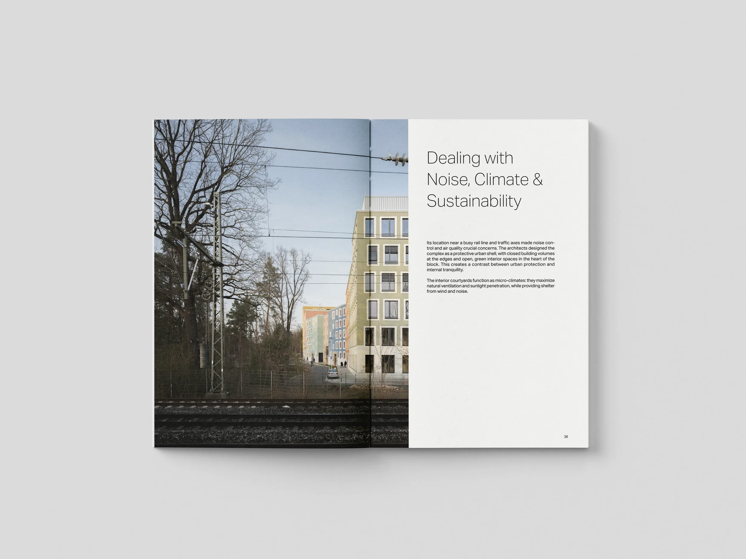
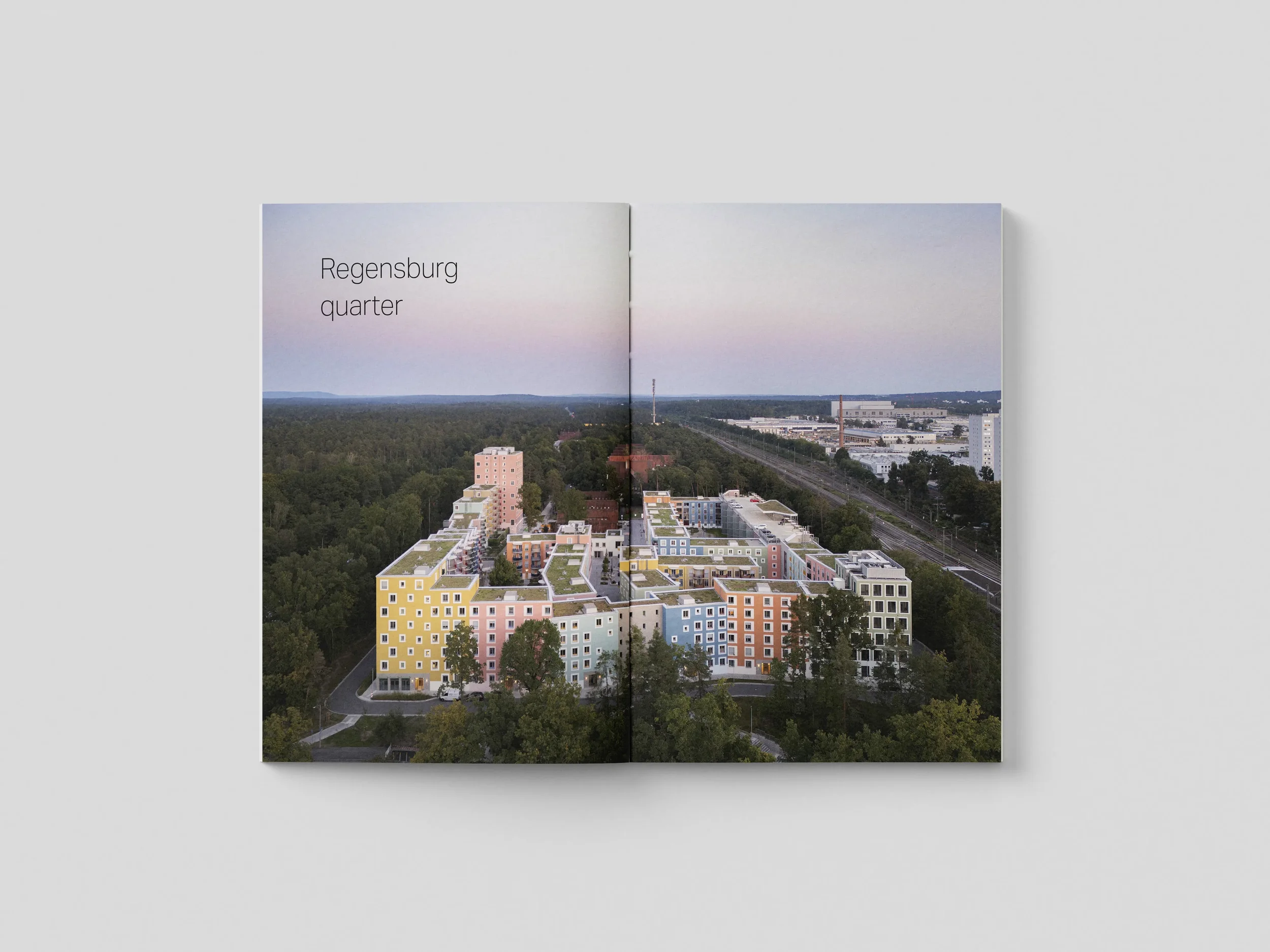
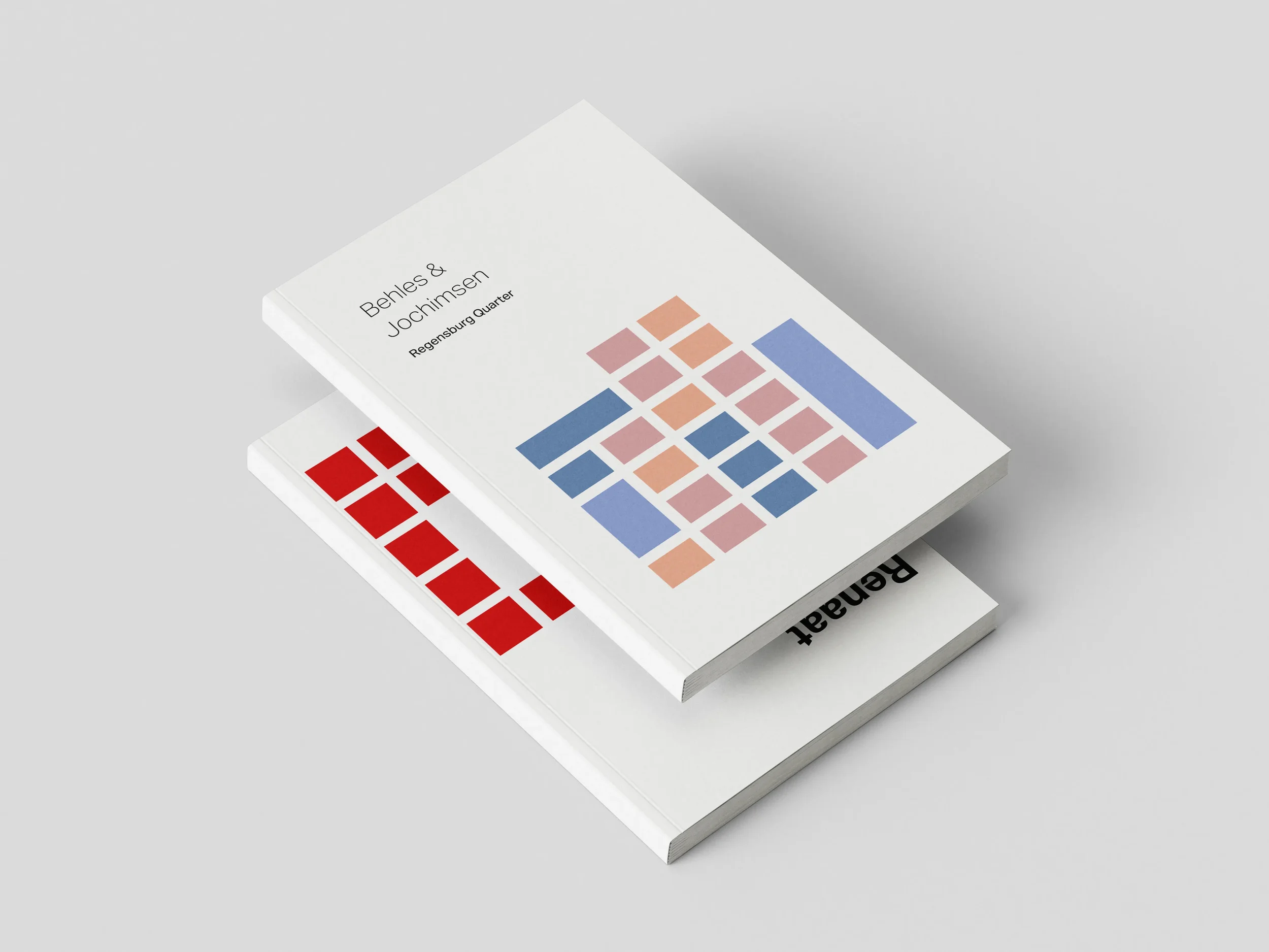
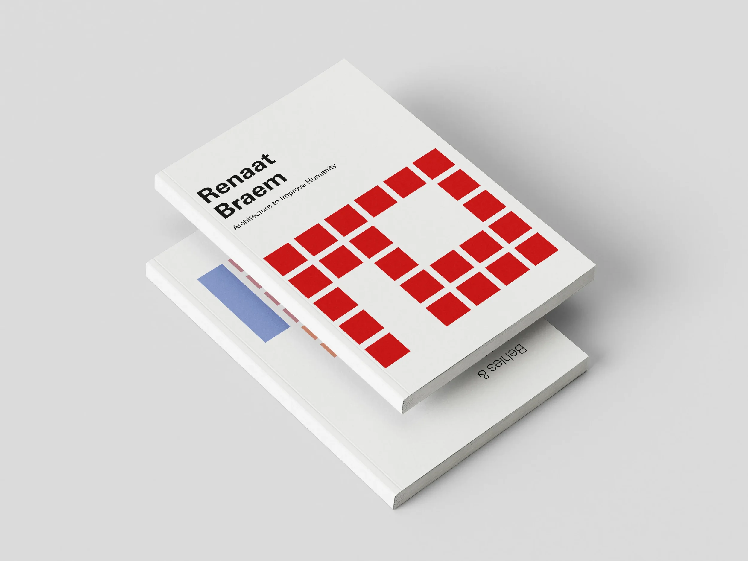
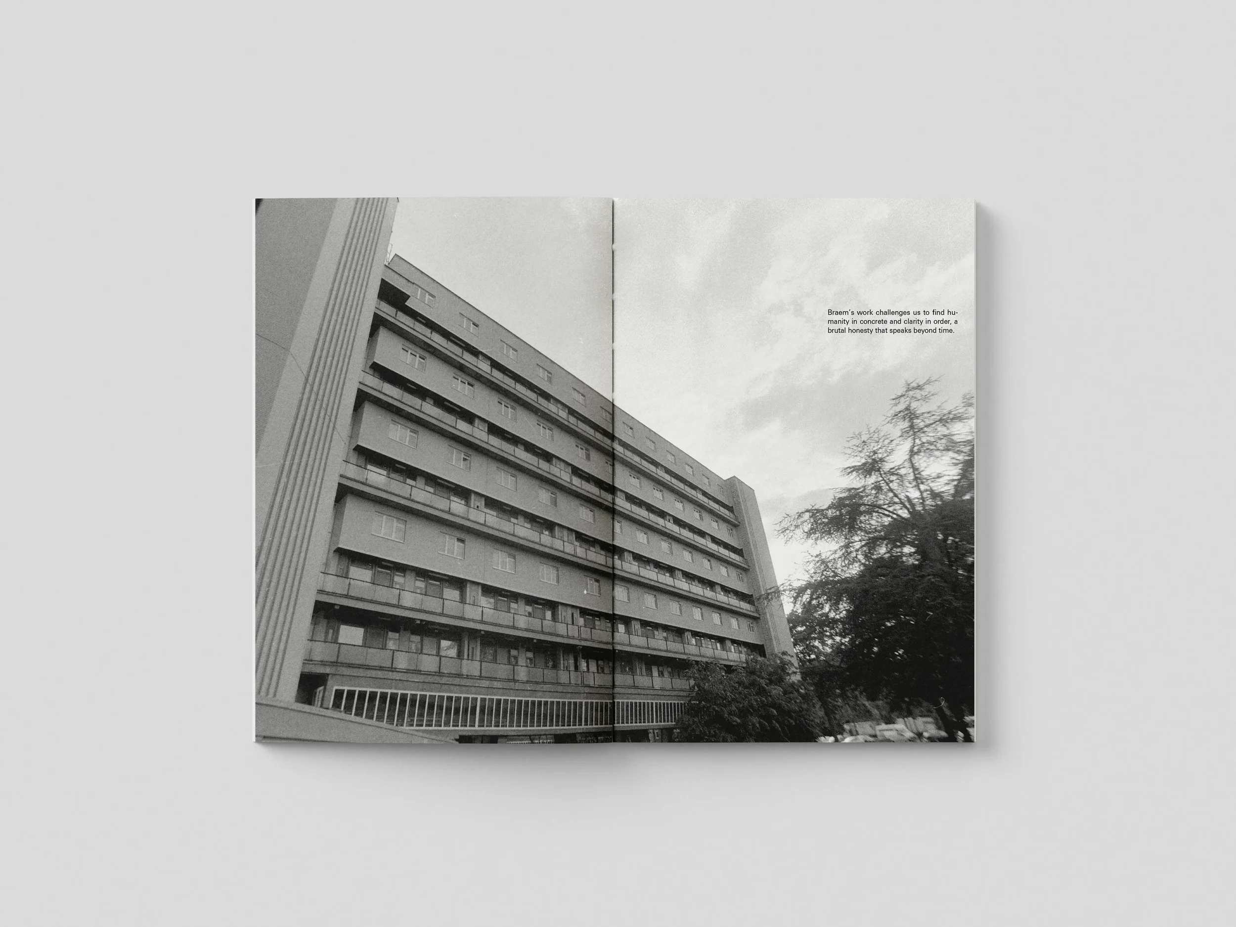
Designed a 112-page book comparing modernist vs contemporary social housing across two eras: Renaat Braem's 1950s Braemblokken in Antwerp and Behles & Jochimsen's 2020s Regensburg Quarter. The book has two covers one flipped 180° so you can start reading from either side. Both projects meet in the middle for direct comparison.
Design challenge
Each half needed its own visual language that matched the architecture. The modernist section uses strict Swiss grids and bold red/black colors. The contemporary section has spacious layouts with gradients and soft tones. Getting the dual-orientation binding mechanics right was tricky multiple print tests were needed.
Solution
The covers work as visual arguments: rigid red grid for 1950s modernist housing, organic gradient blocks for 2020s sustainable design. Even the typography follows each era systematic placement vs. generous breathing room. You literally experience how design thinking evolved by flipping the book.
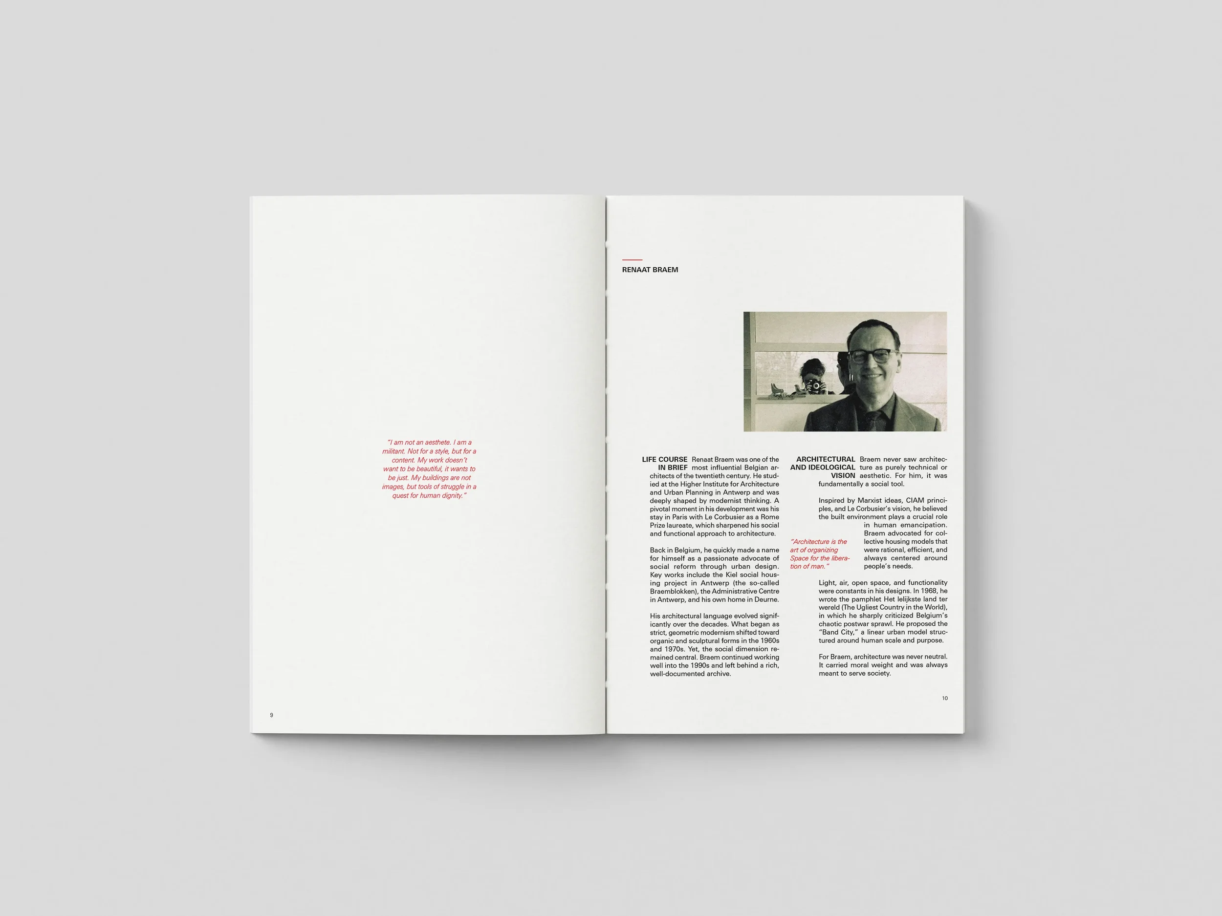
Renaat Braem
Behles & Jochimsen